Creating a clever icon design can be an effective tool to communicate your message.
 What is an icon? At its most basic, it is a representative symbol that should be visually recognizable. A lightbulb, for instance, is a well-established icon that is typically associated with creative thinking, logic or idea.
An icon is not a logo but it can be part of a logo. It can even be color. Think red and green for Christmas.
So how do you arrive at a cleverly designed icon?
Because an icon aims to provide a quick and easy mental connection, it should be designed with the mainstream in mind. A well thought out design, however, should strike the perfect balance between the known and the new.
Using familiar ideas and concepts cuts down on the mental processing time to understand an idea. But if the imagery is too common, the brain simply glazes over it and the message is gone. If it’s too fresh, the message gets lost in translation. The clever icon is the balance between.
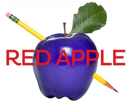
Consider this example: When designing a message about education, the design includes a traditional apple icon but maybe the color is blue. The apple is a familiar education icon, but the blue color would trigger the brain to realize that this message about education is probably something new.
Try a simple brainstorming exercise by making two columns: the known and the new. List words that best describe the message you’re trying to get across under each column. What’s known might include crayons and lunchboxes, while the new could be training or technology.
Have fun with it and be creative!

